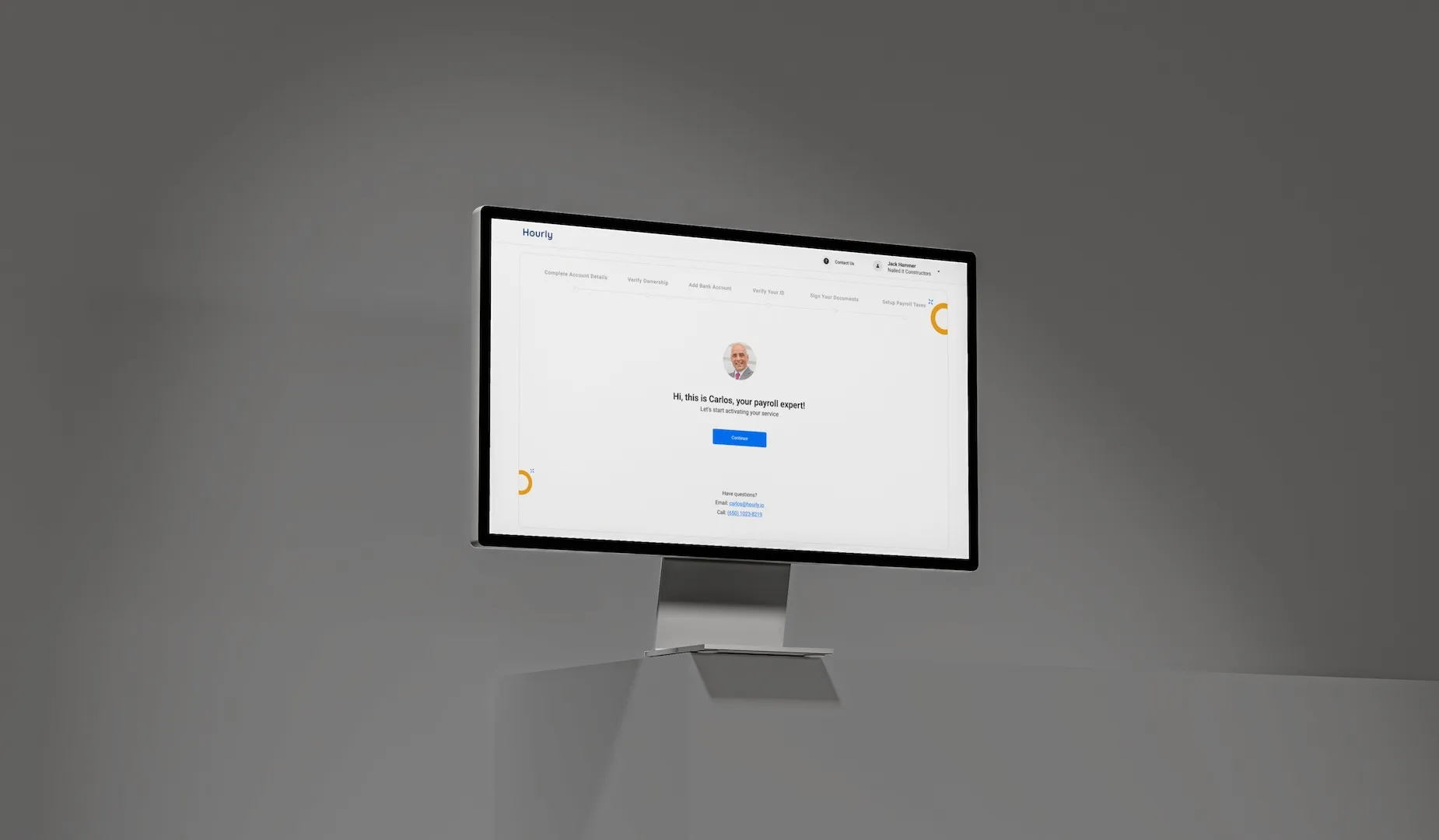
The Hourly Design System
- 3platform libraries, web, iOS and Android, built on one foundation
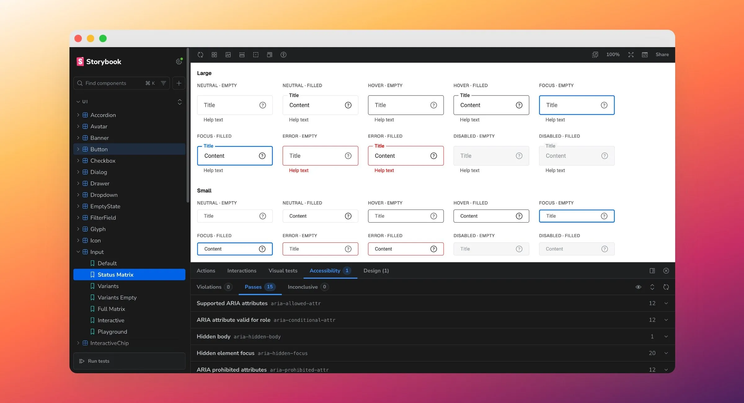
- 40–50web components, each with its sizes, states and variants
- 1:1every Figma component has a coded twin with the same specs
Replacing stock Material and iOS components with one system that carries the brand across web, iOS and Android, from Figma foundations to a coded library in Storybook.
About Hourly
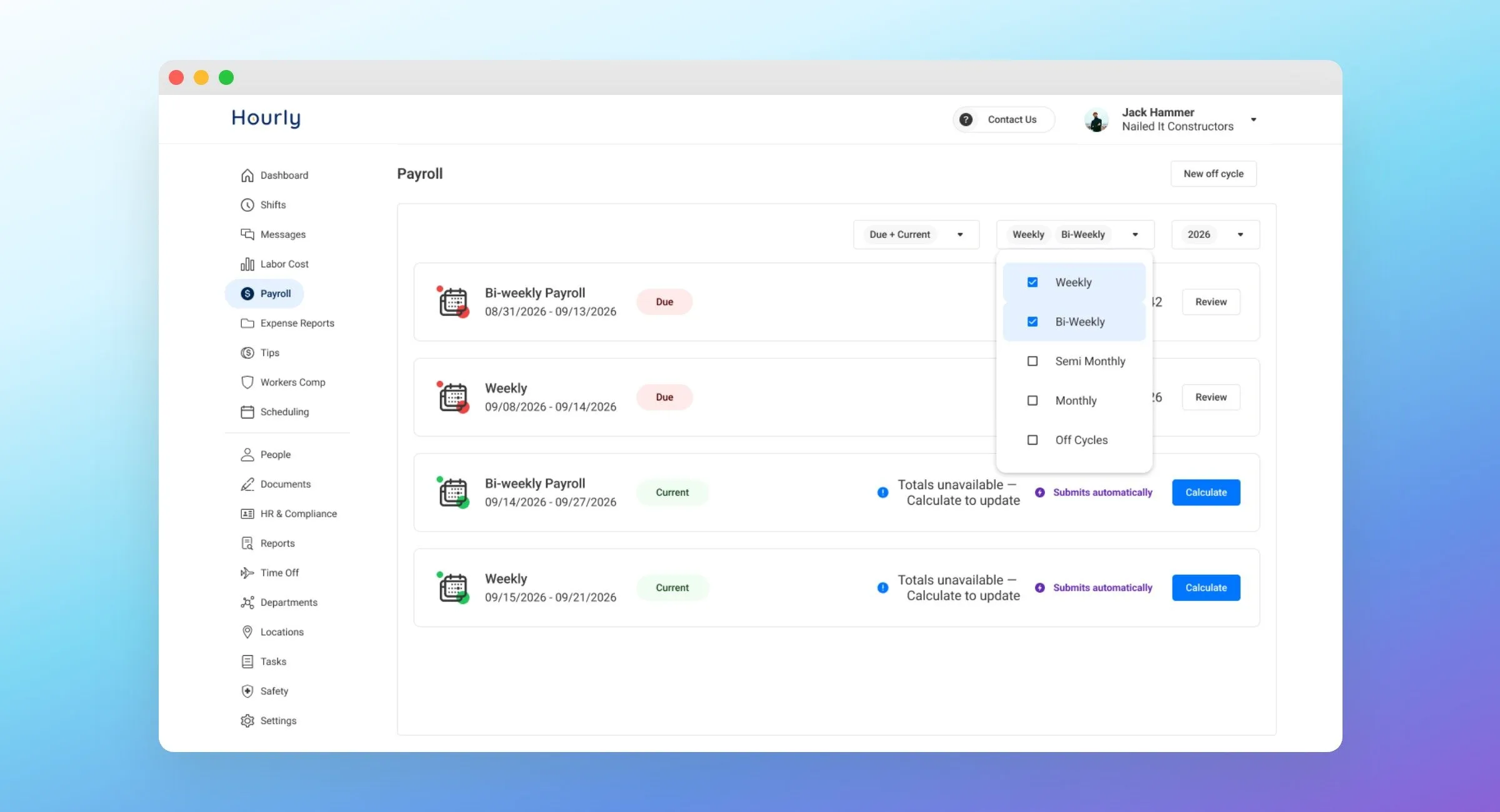
Hourly is a workforce management and payroll platform for SMBs with hourly workers. I joined as its first product designer in 2018, when engineering was building on stock component libraries, and set up the design system the product runs on today.
- Role
- Product Design Director · Systems & Governance
- Timeline
- 2018 – Present
- Location
- Remote
The Problem
When I joined Hourly, engineering built on whatever came in the box: Material Design on web and Android, native components on iOS. That worked while the product was small. As the brand took shape and the product grew, the stock libraries started to fail us in two ways. They couldn’t carry the brand, and they didn’t cover the cases a payroll and workforce product actually needs.
Without a shared foundation, the same pattern looked different in different places. Every new screen was a chance for the product to drift a little further from itself.
The Thinking
Hourly competes in a crowded space, and many of those products do the same things. We agreed early that good UX would be one of our differentiators: the thing that makes the app feel intuitive rather than just complete. That’s hard to protect screen by screen. It needs a system.
I pitched it to the CEO and the head of engineering. It wasn’t a hard sell. They already trusted the design governance, and a reusable system was an easy benefit to see. The harder part was the trade-off that came after. A system costs engineering time to build the first time, and an early-stage startup needs to launch fast. Every component was a balance between building it properly and shipping what the business needed that month. The case for paying that cost up front was speed later: once a component exists, design and maintenance get much faster.
The Solution
I did the research and set the structure the system would follow: tokens in three levels. The primitives came first, because everything else inherits from them. Primitives hold the raw values: color, type, spacing. I built the colors as shade scales in OKLCH, a perceptually even color space, so the scales hold up long term, the semantic and component layers can flex without breaking consistency, and contrast meets WCAG at the foundation, before a single component exists. Semantic tokens give those values a job. Component tokens go one step further, so a button’s padding, type and border each point to a named token instead of a raw value. Components are built only from those tokens.
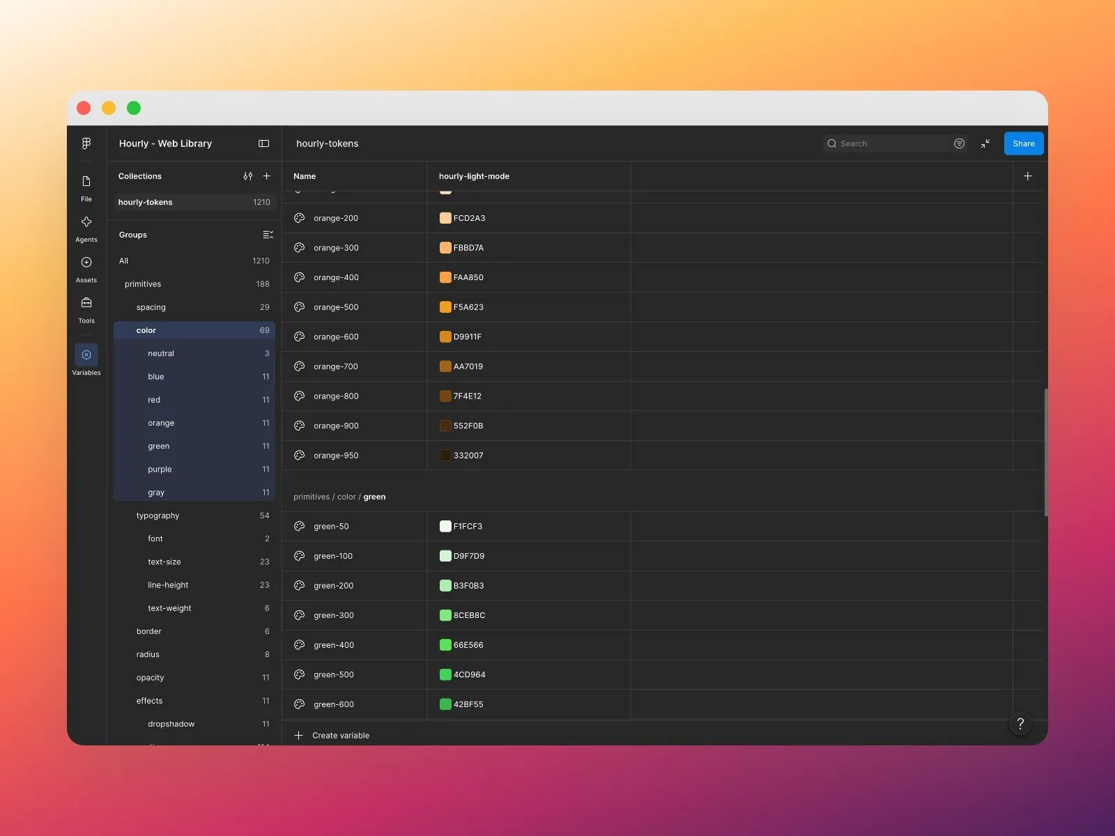
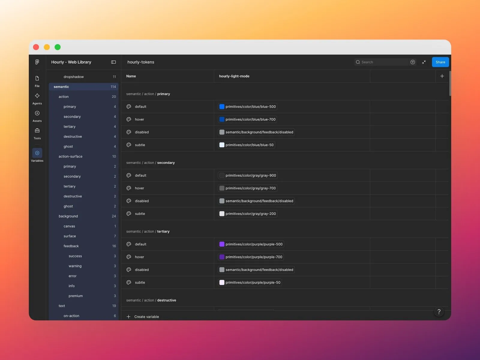
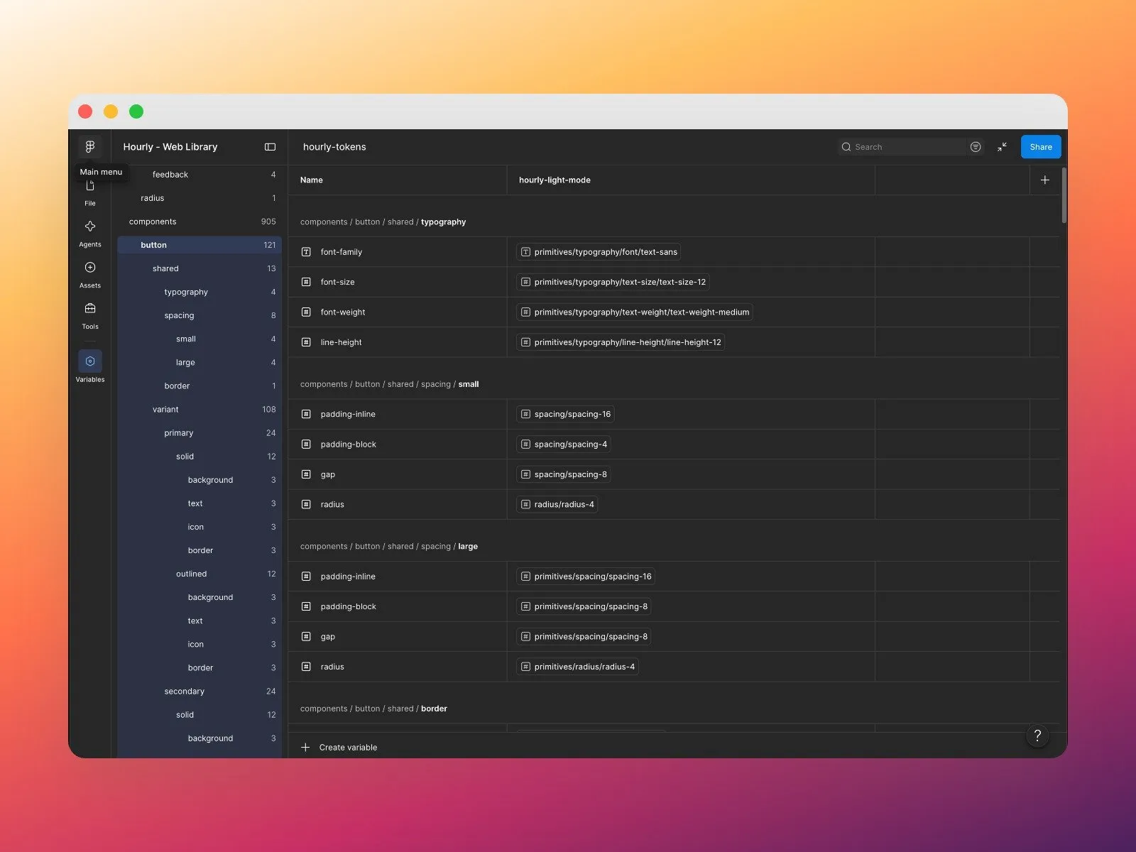
With that foundation in place, I worked closely with a senior designer on my team, and we built the components together. The web library became the reference for mobile: we taught the other designers the process, and they followed it to build the iOS and Android libraries on the same layers, with native components that still inherit from the same source. The designer guide lives in Figma beside the components: when to use each one, its variants and its states.
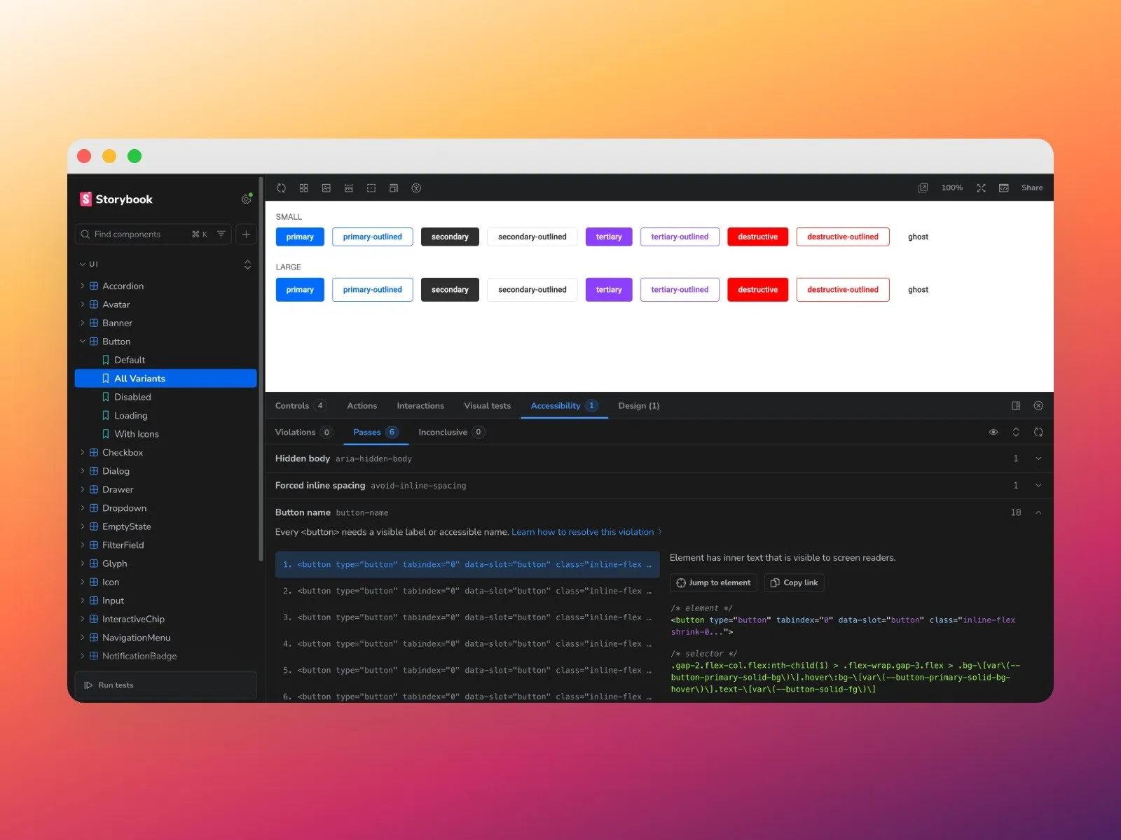
Developers needed the same clarity. I run regular sessions with the engineering team on what’s new in the system and how it helps them and our customers, through consistency and good practice. For the last couple of years, engineers built the components in Storybook, and design reviewed and approved each one.
Since last year I’ve been leading the move to a new coded library, and that part I build myself, since code is where I’m most fluent. It keeps the same layers: CSS holds the primitives, Tailwind the semantic tokens, and shadcn/ui the components, all documented in Storybook. Every Figma component now has a 1:1 counterpart in code, built to the same specs. I use Claude to build on that base, and to read a Figma design’s specs and assemble it from our own components.
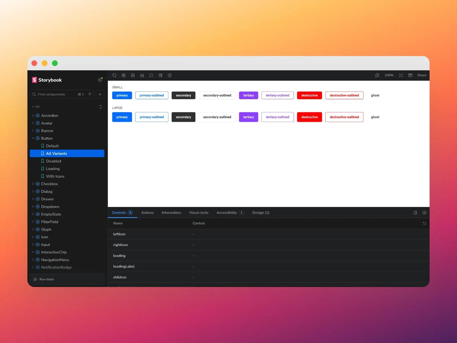
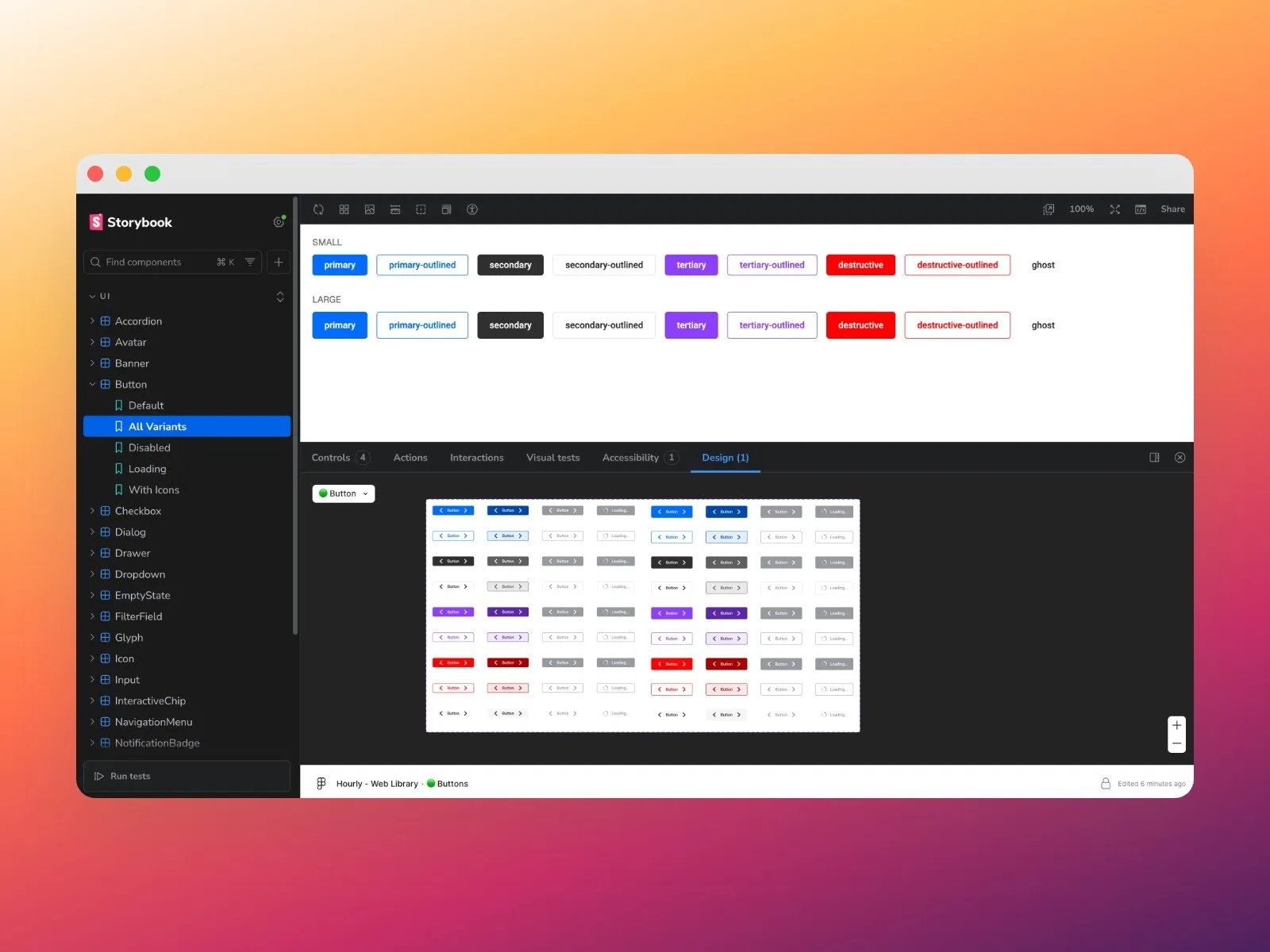
Accessibility is part of the definition. Because I now build and manage the components in Storybook, I added checks that run per component: WCAG validations and accessibility scores, so each one has to meet AA at least before it ships. Before, developers built and tested components themselves, and accessibility was sometimes left out. Now it’s built in, and it’s design’s responsibility.
Impact
The first change was clarity. With the Figma foundations in place, developers could see exactly what designers expected, with written guidelines instead of interpretation. Design got faster too, because designers now assemble screens from the system. That speed was the core of the original pitch. We never put a stopwatch on it, but it shows in the work: nobody has to decide how a component or one of its states should look and behave anymore. They use it, and every variant has already been approved by design direction.
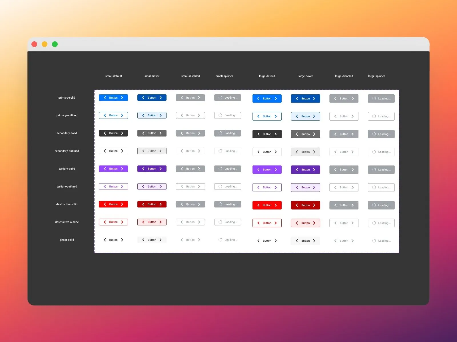
The library has grown to 40–50 components on web alone. Each one multiplies into its sizes, states and variants: small and large; default, hover, disabled and loading; primary, secondary, tertiary, destructive and ghost, each solid or outlined. The web library is the foundation the iOS and Android libraries follow, and every Figma component has a 1:1 twin in code.
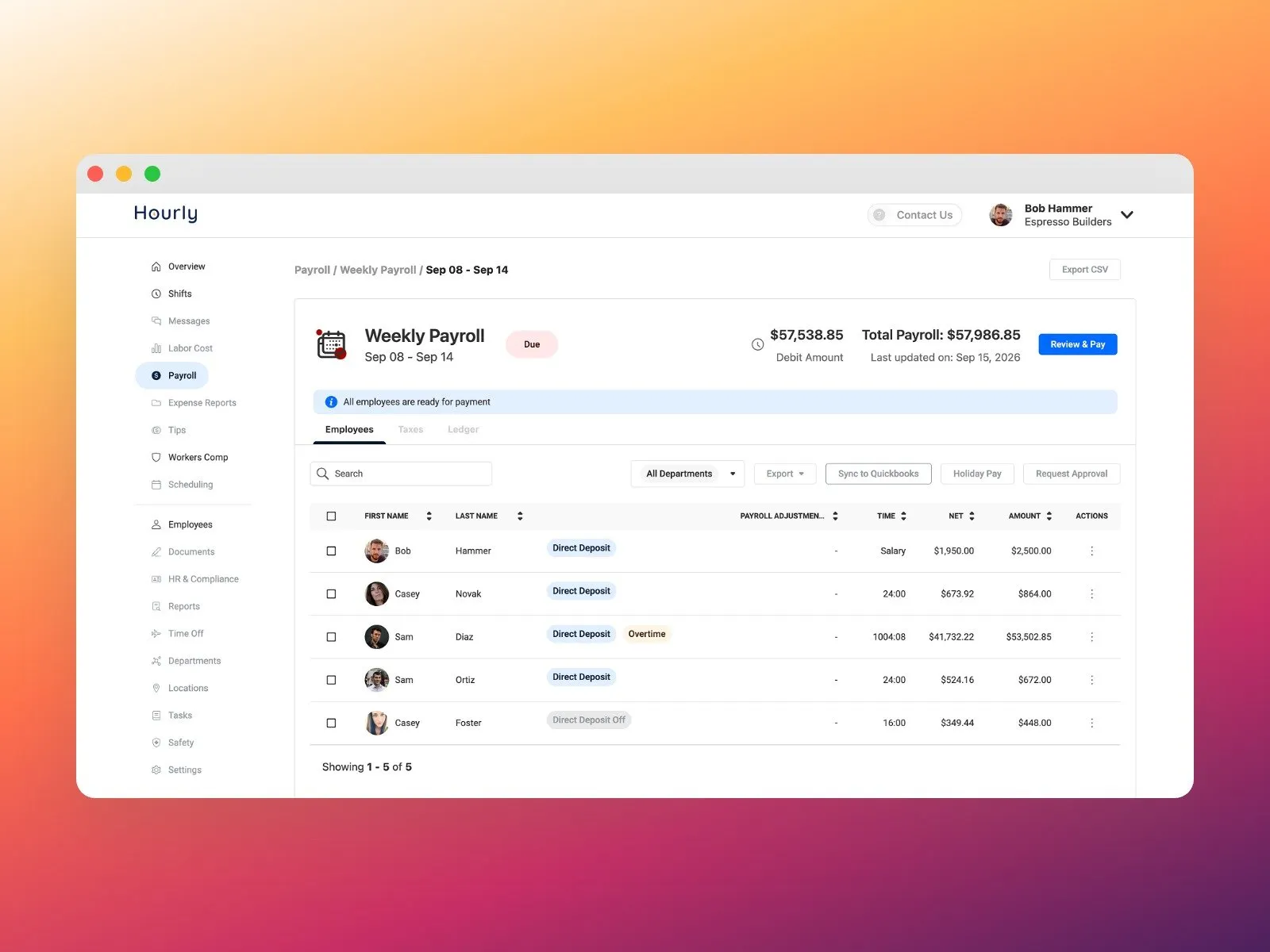
The coded library changed how we work with stakeholders. We can show complex interactions and good motion in a working prototype instead of describing them, and test real flows with users. When a feature is big enough to take to leadership, the Director of Product Management, the Director of Engineering and I present it together. Non-technical stakeholders can now click through the real flow in code, not a picture of it. Testing got faster too. With AI in the workflow, we validate at the component level much faster, work that used to sit with developers and didn’t always go well. And because the WCAG checks live in each component, accessibility is the default instead of something that depends on who built the screen.
Reflections
The biggest lesson changed how I see design systems. A system is never finished. It’s an evergreen project: it has to keep adapting to new technology, new components and new requirements. Part of the job is reminding stakeholders and developers, again and again, that building it once doesn’t mean it supports itself.